Install and Configure Waybar in Hyprland
If you are a regular at various desktop customization communities on the web, then you must have heard of Waybar.
Waybar is a highly configurable Wayland bar for Sway and other Wlroots based compositors.


Here’s a video that demonstrates Waybar:
In this article, I’ll show you the process of installing and configuring Waybar on a Hyprland system.
This does not mean you need to install Hyprland exclusively to continue. You can ignore the Hyprland related part and still get a decent bar for your system.
Installing Waybar in Linux System
If you are an Ubuntu user, Waybar is available in the repos of Ubuntu 20.04 and more. Since Waybar is Wayland, it is better to use it in version 22.04 and above.
To install it, use the command:
sudo apt install waybar
There is a PPA available with more up-to-date packages. To use it, open a terminal and run:
sudo add-apt-repository ppa:nschloe/waybar
sudo apt update
sudo apt install waybar
For other systems like Fedora, Arch Linux, etc., you can use the native package manager to install the latest version of Waybar.
# Fedora systems
sudo dnf install waybar

# Arch Linux Systems
sudo pacman -Syu waybar
Once installed, autostart the bar during system startup.
In Hyprland, you can use the following line in the configuration file .config/hypr/hyprland.conf:
exec-once waybar
Configuring Waybar
Now that you have Waybar installed, let’s see the Waybar configuration.
Waybar uses a JSONC (JSON with Comments) to configure its vast array of modules. Before you start to edit the configuration, I advise using a text editor that has JSON support.
I have used VS Code to edit the configuration file.
The Waybar configuration file is present at .config/waybar/cnfig.jsonc.
Items that can be placed on Waybar are available as separate modules. This means that you can handpick the modules and their placement as per your requirement.
A default sample configuration
Let’s take a bare minimum sample config provided by Waybar on its wiki page to learn the structure.
{
"layer": "top",
"modules-left": ["sway/workspaces", "sway/mode"],
"modules-center": ["sway/window"],
"modules-right": ["battery", "clock"],
"sway/window": {
"max-length": 50
},
"battery": {
"format": "{capacity}% {icon}",
"format-icons": ["", "", "", "", ""]
},
"clock": {
"format-alt": "{:%a, %d. %b %H:%M}"
}
}
In the above code snippet, you can see several key-value type pairs arranged. Let’s understand them:
- layer: This decided whether the bar goes below a window or the window goes below the bar. It can take bottom/top values.
- modules-left: Specify what modules should be displayed on the left part of the bar.
- modules-center: Specify what modules should be displayed on the center part of the bar.
- modules-right: Specify what modules should be displayed on the right part of the bar.
- sway/window, battery, clock etc.: Individual module definition.
From this, you get an idea that on the position specification (left/center/right), you specify the name of the modules that you want to appear.
Later, you define those individual modules with available options regarding their appearance.
For example, in “battery” module, you specified that its format should be capacity percentage and an icon. Where you format that icon in format-icon option.
As I said earlier, each item in Waybar is a configurable module. If you visit the Waybar wiki, you will get the entire list of modules available in Waybar in the right sidebar.
If you want to add a custom module, that is not in the default Waybar module, use the format “custom/module_name”. This same name “custom/module_name” will be used at both placing of the element in bar and defining it.
Creating an example Waybar configuration
You have seen the sample config. Now, let’s write a sample Waybar configuration from scratch to learn it better.
My requirements in this configuration are:
- A menu button to open Wofi launcher (Left side).
- A Taskbar that shows the opened windows (Left Side).
- Hyprland Workspace switcher with 5 workspaces (Center).
- A Clock that will show date when clicked (Center).
- A CPU core usage monitor (Right Side).
- My system uptime monitor (Right Side).
- A network module that show download and upload speed (Right Side).
Let’s start the configuration.
Common Waybar settings
In this first block, we will place the bar as the top layer. That is, any window will go down if overlapped. Also, the bar will be placed on the top side of the monitor.
//Make the bar as the top layer.
"layer": "top",

// Make waybar appear at the top of the screen. You can give "bottom/left/right" also as needed.
"position": "top",
Now, let’s place the items as per our requirement.
//Define what items should appear in the left part of the waybar.
"modules-left": ["custom/appmenu", "wlr/taskbar"],

//Define the items to appear in the center part of the bar.
"modules-center": ["hyprland/workspaces", "clock"],

//Define items to appear in the right side of the bar.
"modules-right": ["cpu", "user", "network"],
Here, you can see that I used one custom module called custom/appmenu. The purpose of this module is to make Wofi launcher appear when clicked.
That’s it. You have now set the common bar settings. It is time to define the individual modules.
Define the Modules
Let’s define everything in the order we have created.
App Menu
First, the app menu.
"custom/appmenu": {
"format": "Menu {icon}",
"format-icon": "",
"rotate": 0,
"on-click": "~/.config/waybar/runwofi.sh"
},
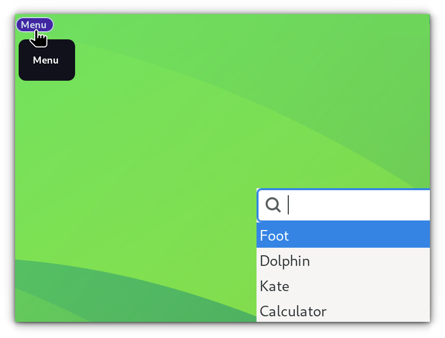
We define a module in the format specified above. This is a custom module. For custom user-defined module, there are several possible options. Refer to this table to know more about the available options.
In the example, we set a custom text “Menu” using the “format” key. The “{icon}” specified in the format will be configured in the format-icons key. Just paste the icon you want to appear under double quotes in format-icons key.
The “rotate” key is used to specify the text rotation. If it is 90, then the text will appear vertical.
The next step is critical. The “on-click” key defines the action to perform when the module is pressed with one left-click. Here, we have given the location of a shell script “runwofi.sh”. So, when you click on this, that script will be executed.
The content of that executable script is:
#!/bin/bash
wofi --show drun
So, when you click, Wofi is executed.
Taskbar
Let’s create a simple task bar. There is a built-in module for a taskbar in Waybar. It also has several possible options.
"wlr/taskbar": {
        	"format": "{icon}",
        	"tooltip": true,
        	"tooltip-format": "{title}",
        	"on-click": "activate",
        	"on-click-middle": "close",
        	"active-first": true
   	 },
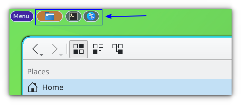
Some options are self-explanatory, like the tooltip and its format, where the “{title}” will show the title of the application as a tooltip when hovered. You can use {name} to show the name of the application window instead of title.
The on-click, on-click-middle actions are defined according to what states are available in the taskbar module. Please refer to the Actions subsection of the module in the Waybar Wiki.
We set the option called “active-first” to true. This will bring whatever application currently active to the first entry of taskbar. Just an accessibility option.
Workspaces
Here, we define the workspaces. For Hyprland users, there is this “hyprland/workspaces” module. You can use this.
In Hyprland, before setting workspaces in Waybar, you need to make sure that you have workspaces enabled for the current monitor.
On a terminal, run:
hyprctl monitors
This will list the available monitor with their name. I was using Hyprland on a GNOME Boxes VM. So, my monitor name was Virtual-1. Yours can be DP-1, HDMI-1, etc. Please check them.
See the config below:
"hyprland/workspaces": {
"format": "{name} : {icon}",
"format-icons": {
"1": "",
"2": "",
"3": "",
"4": "",
"5": "",
"active": "",
"default": ""
},
"persistent-workspaces": {
"Virtual-1": [1, 2, 3, 4, 5]
}
},
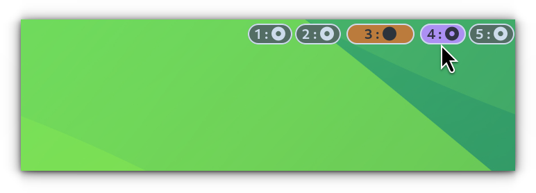
Under “persistent-workspaces” option, you will place the number of workspaces to show permanent as an array with monitor name as key. I placed 5 workspaces on my Virtual machine monitor.
Clock
Next is the clock module (example code from Waybar wiki). Look at the snippet below.
"clock": {
"format": "{:%I:%M %p}",
"rotate": 0,
"format-alt": "{ %d·%m·%y}",
"tooltip-format": "<span>{calendar}</span>",
"calendar": {
"mode": "month",
"format": {
"months": "<span color='#ff6699'><b>{}</b></span>",
"days": "<span color='#cdd6f4'><b>{}</b></span>",
"weekdays": "<span color='#7CD37C'><b>{}</b></span>",
"today": "<span color='#ffcc66'><b>{}</b></span>"
}
}
},
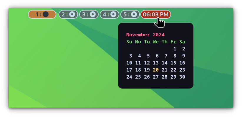
You can refer to the time format specification guide to customize the clock format to your liking.
Here, I have gone for:
- I : 12 hr clock (Use H for 24-hour clock)
- M : Minute as a decimal number.
- p : AM/PM for the 12-hour clock.
Here, we come across another key, format-alt. This key is used to set an alternate format when clicked on that module.
In the above example, I set the format-alt to show a calendar icon followed by the date (Day-Month-Year).
If you refer to the Waybar wiki, you can see a subsection for the Clock module, called calendar. So, under the Clock main module, you can add this calendar as well.
In the sample config, we have added the calendar as a tooltip (tooltip-format key). And as we saw earlier, whatever written inside the curly braces (here, calendar) is expanded in the next step.
CPU
Here is a sample code. The concept is similar to what we have seen. But it has a new item to learn.
"cpu": {
     		"format": "{icon0} {icon1} {icon2} {icon3}",
     		"format-icons": ["▁", "▂", "▃", "▄", "▅", "▆", "▇", "█"],
	},
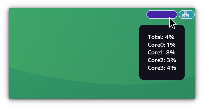
In case of CPU, the {iconN} is the Nth CPU core usage. But what we have to learn here is the format-icons.
You can see that the format-icons have been given an array of input (inside closed brackets). Inside the array, we have given 8 different sized blocks. We get a 12.5% increment (100/8). So, whenever a core usage jumps above 12.5%, that block will move to the next size.
This can be used in battery module as well to show different percentages.
I will give the sample code for the next block, network. It uses the same concepts we have seen in earlier sections.
// Define Network
"network": {
"tooltip": true,
"rotate": 0,
"format-ethernet": " ",
"tooltip-format": "Network: <big><b>{essid}</b></big>nSignal strength: <b>{signaldBm}dBm ({signalStrength}%)</b>nFrequency: <b>{frequency}MHz</b>nInterface: <b>{ifname}</b>",
"format-linked": " {ifname} (No IP)",
"format-disconnected": " ",
"tooltip-format-disconnected": "Disconnected",
"format-alt": "<span foreground='#99ffdd'> {bandwidthDownBytes}</span> <span foreground='#ffcc66'> {bandwidthUpBytes}</span>",
"interval": 2
}
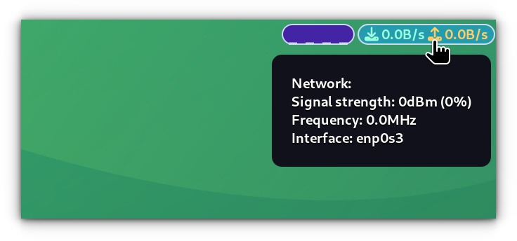
Now that, we have made our simple Waybar config. Save the configuration file.
You have a fully working Waybar at the top now. Reboot your system or relogin to see the effect.
Theme the Waybar
Throughout the above section, you have seen how to configure the modules in Waybar. Whoever completed the above config will get the Waybar in its default theme.
But Waybar is even more customizable. Even better, it relies on CSS to style the look.
Style file should be present as ~/.config/waybar/style.css.
It is out of scope of this tutorial to teach you each CSS module. Instead, I will tell you how to access each module in CSS.
First, go to the Waybar Wiki.
Here, inside each module, at the very bottom, there is this “Style” section. You can see what tag is used to access that module in CSS.
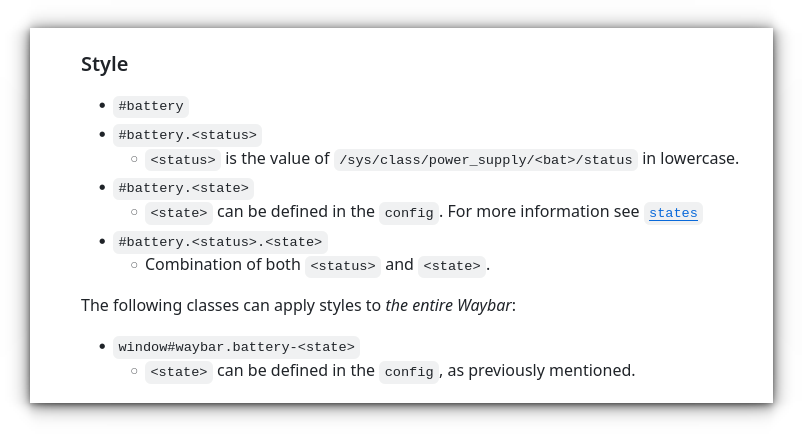
From the above screenshot, #battery is used to access the main battery module, while there are several other styles, that you can theme in the CSS.
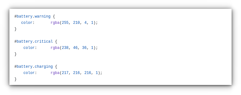
See the Robinhuett CSS file, that customizes different states of the battery?
Let’s see some important tags.
| CSS Tag | Use |
|---|---|
| window#waybar | Main waybar window |
| .modules-left .modules-center .modules-right | Three parts of Waybar |
| #cpu | For CPU module |
| #clock | For Clock module |
| #workspaces | For Hyprland workspaces |
| #custom-modname e.g. #custom-appmenu | For Custom modules |
Download my config file
You can download the full configuration file and the associated CSS Styles from our GitHub repo.
Once downloaded, paste these files inside the .config/waybar directory.
I have already shown what the final version looks like in the demo video at the beginning of this tutorial.
You can enjoy customizing it even further 😄
